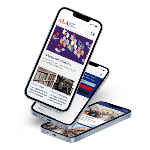
Consolidate 40+ disparate legacy websites and microsites with a modern, accessible, world-class website design and upgraded technology platform. Website engagement rate improved from 35% to 57% year over year.
BACKGROUND
The American Library Association (ALA), founded in 1876, is the oldest and largest library association globally. ALA is committed to enhancing learning and ensuring information access for all. The association's website serves as a crucial resource for members, librarians, the press, and the general public, yet it faces significant challenges due to its outdated and fragmented structure.
THE CHALLENGE
The ALA's web presence was previously split across 30 separate websites, leading to a disjointed user experience and brand inconsistency. The outdated content management system interface, complicated content types, and lack of attractive layout tools resulted in inconsistent presentation and limited cross-organization content sharing. This complex web of sites hindered the ALA's ability to communicate with its diverse audience effectively. One of the most critical aspects for any association or membership organization is developing engaged and loyal members, a key goal of this redesign was to enhance member engagement digitally.
THE SOLUTION
The ALA website redesign and upgrade focused on several key improvements:
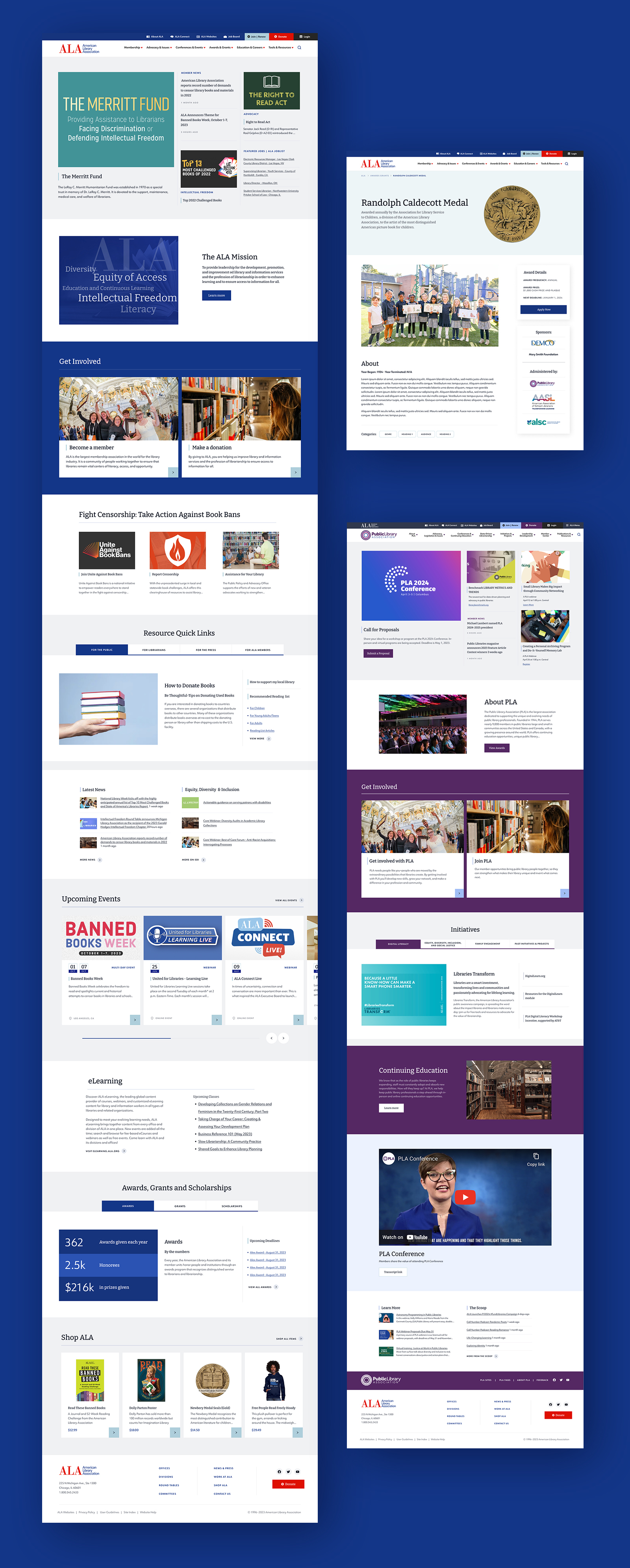
Unified Platform: Migrate to a modern Drupal platform and hosting solution to consolidate over 40 websites and microsites into one cohesive website, maintaining brand consistency while allowing for custom microsite branding.
User-Centric Design: Implement an elegant editing interface for site builders, supported by a flexible design system accommodating full-width pages, sidebars, and various column layouts with a plethora of component options.
Microsite Flexibility: Create a modern microsite solution with custom branding, navigation, and user permissions, ensuring microsites align with the broader ALA site's design while retaining individual identity.
Membership Integration: Enable single-sign-on and synchronization with the association’s iMIS membership system to ensure restricted access by members to membership information, a key concern for librarians who may be targeted for harassment. Enable members to share content with specific membership groups.
Search Engine Optimization: Improve SEO techniques to boost traffic and membership.
Cost Efficiency: Decrease ongoing support costs by streamlining the website’s infrastructure.
THE PROCESS
Discovery & Strategy
We started the project with a kick-off meeting with the key stakeholders to confirm key goals, timelines, potential risks, and major pain points with the previous website. For example, we discovered that the previous version did not have sufficient design options to display critical content, and the information hierarchy was confusing to both members and new visitors.
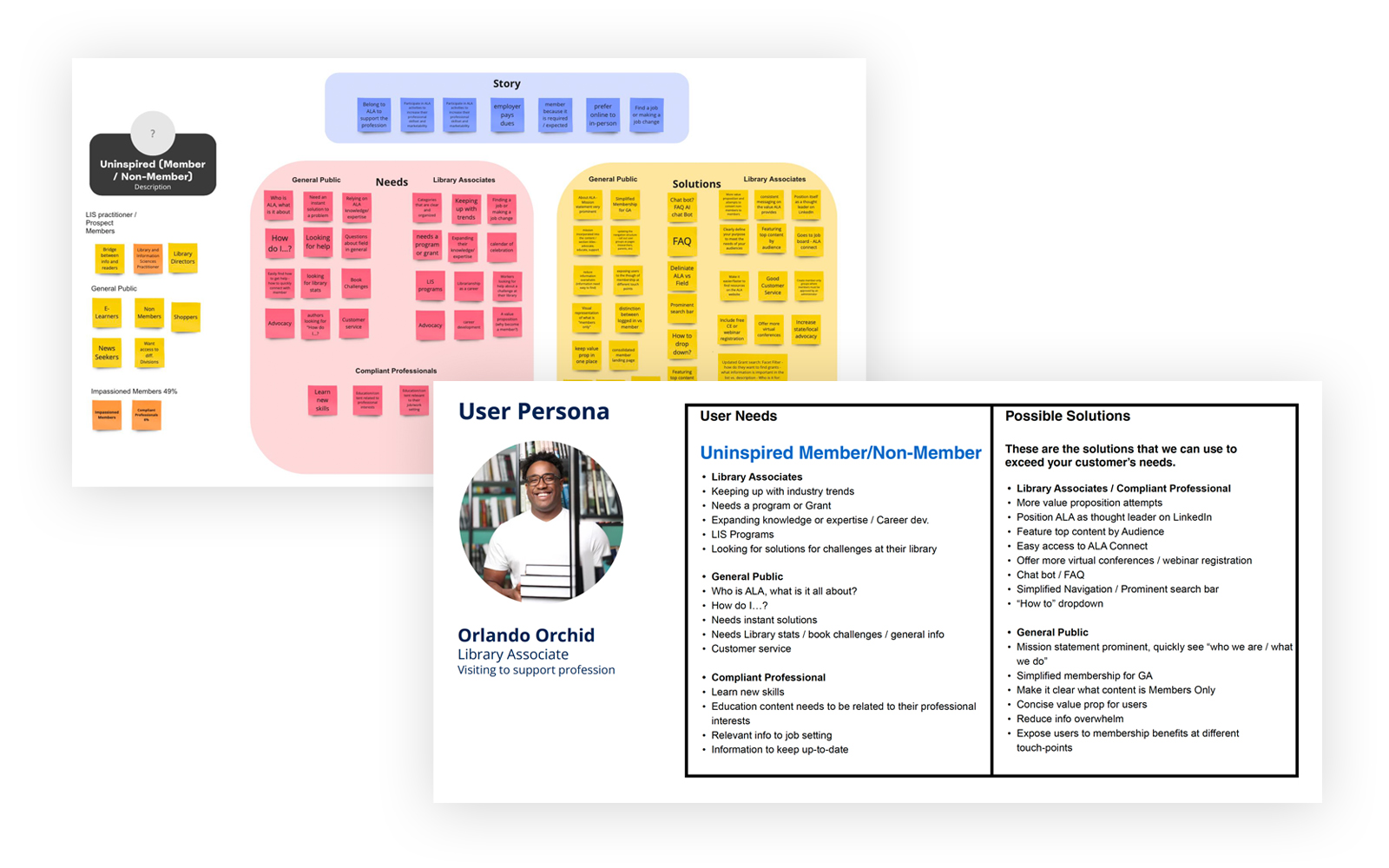
Through a series of creative strategy workshops we identified the key ALA brand attributes and developed an understanding of ALA members and website visitors through user profiles. We conducted interviews with members, website visitors, and ALA leaders to understand better how these constituents interact with the organization. From these insights, we iterated to develop a new and simplified information architecture.
This research process included evaluating the content types and taxonomies on the current site and mapping these to the new website. We call this process content mapping, and this process helped us streamline the content organization of the website while planning for future content migration. This extensive content modeling involved content usage audits and preparing templates for each content type to solicit stakeholder feedback. From there we were able to reduce and consolidate the number of overall content types from 38 to 15 and streamline and reduce the complexity of form fields greatly.
In addition, we leveraged a user behavioral analytics tool, Microsoft Clarity, to drive toward objective content decisions such as the importance to ALA site users of ALA’s work with Banned Books and making this a prominent section on the homepage.
User Experience & Design
The American Library Association (ALA) website redesign project placed a significant emphasis on enhancing the user experience (UX) and design to ensure the site met the needs of its diverse user base.
Style Tiles
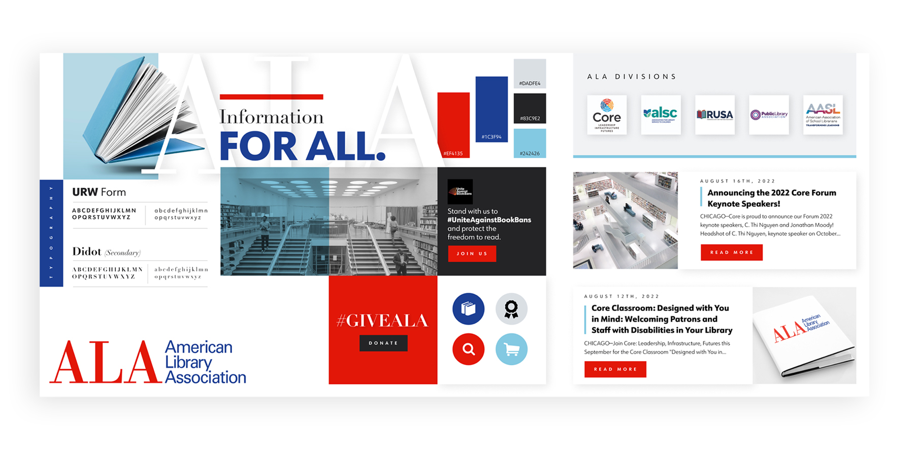
The first step in the design process was to develop style tiles. Style tiles are visual references that serve as a middle ground between initial sketches and full prototypes, allowing stakeholders to quickly iterate on the website's visual design language without the need for fully designed pages.
These tiles included key elements like color schemes, typography, iconography, and interface elements that encapsulate ALA's aesthetic. Our objective was to create a flexible design system that could accommodate various types of content and user interactions while staying true to the ALA's brand identity.
For example, we refined ALA’s existing color palette and the saturation of colors for a brighter, fresher look. We also introduced a few tertiary colors to be used as accents throughout the site. When used strategically, color is a powerful tool for communicating a brand's message and creating brand recognition.
Through the years, ALA didn't have a standard typography practice in place. We introduced a combination of modern, yet timeless fonts with a set of serif and sans serif typesets. We utilize the modern serif Bitter, to keep an academic, but casual feel. To increase readability, we elected to use our serif font in small segments like section titles, and headlines. For the sans serif, primarily used for body copy, we chose the highly legible font, URW Form. URW Form is a mix of classic and modern geometric typefaces with many styles, yet still incorporates the fundamental rules of design and looks and functions like a contemporary sans.
Wireframes
Concurrently, our team focused on creating wireframes for key pages. Wireframing is a crucial step in the UX design process as it lays out the structural foundation of the website. We tackled this in two distinct tracks: Mobile and desktop, acknowledging the importance of responsive design in today’s multi-device world.
One key challenge in wireframing arose from the need to ensure that all stakeholders could fully engage with and contribute to the design process. Recognizing that traditional wireframes (often characterized by gray boxes and text) might not provide the complete picture needed for effective decision-making, our Design team innovated their approach.
After spending some additional time in the style tile phase to select fonts and upgrade our color palette, we decided to create high-fidelity wireframes in order to save some time in the design phase. This also allowed our internal stakeholder usability testing participants to begin to visualize the design direction, without giving away the fully-designed experience. Each participant was assigned a different user journey, so it was important to have our navigation appear more refined at this stage of wireframes. The usability study provided valuable feedback and we were able to quickly iterate our wireframes and move on to the design phase.
We shifted to using high-fidelity wireframes earlier in the process, which featured more detailed, visually engaging designs. This adaptation facilitated a deeper understanding and brought the client’s vision to life more effectively, enabling a smooth transition through refinements to the final designs.
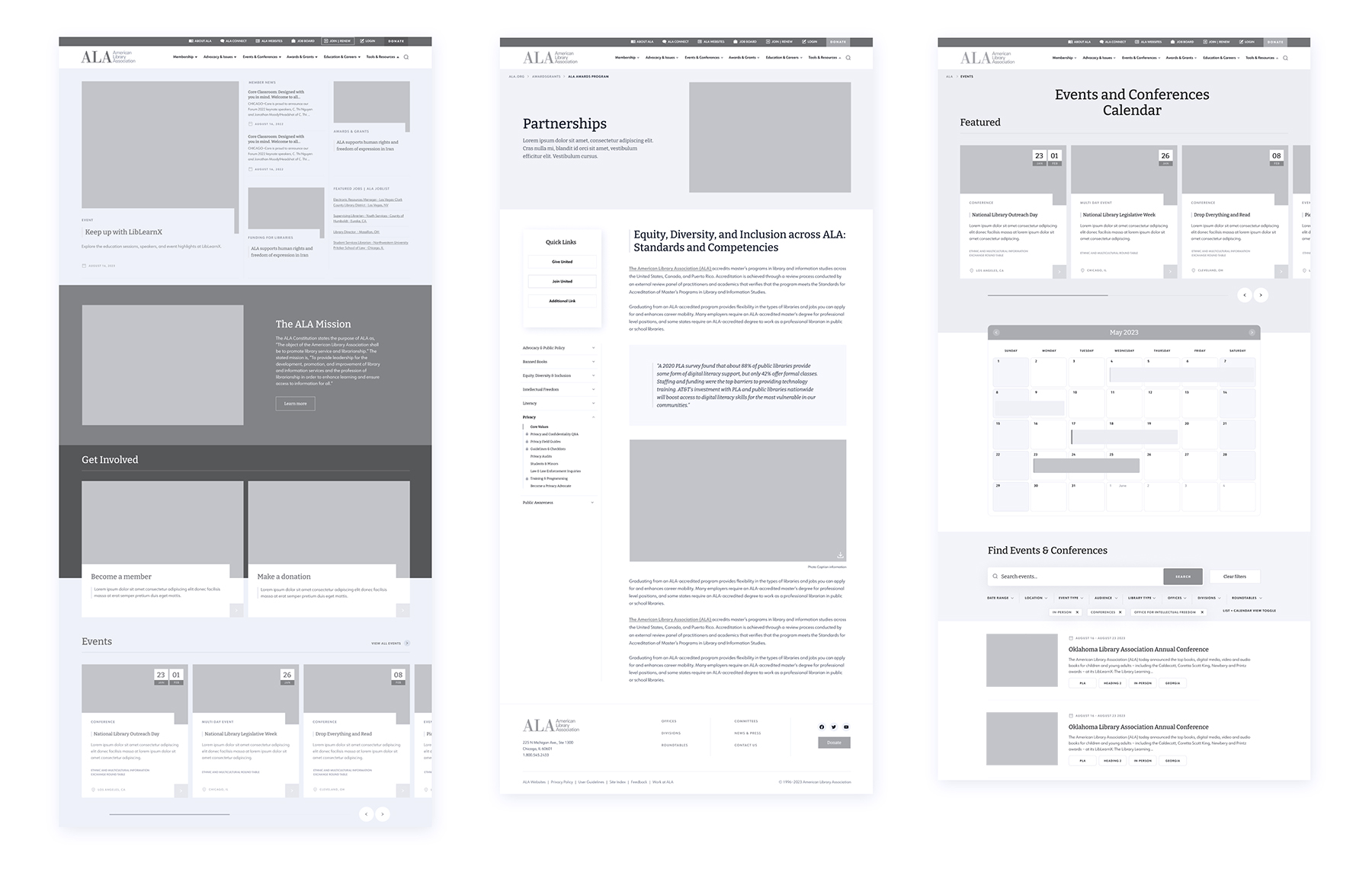
Once the style tiles and wireframes were developed, we brought these elements together to guide the new design. This process involved applying the visual elements defined in the style tiles to the structural layouts depicted in the wireframes. This synthesis brought the project from abstract concepts to tangible designs that stakeholders could interact with and evaluate.
The team conducted several review sessions where we evaluated the initial designs against the project's goals, user needs, and usability principles. These sessions were crucial for gathering feedback, which informed the ongoing refinements to the designs. Our objective was to ensure that the designs not only looked stunning but also facilitated a seamless user experience.
A notable challenge during this phase was ensuring that the designs were flexible enough to accommodate the diverse interests of various stakeholders such as the internal ALA team and various departments, current members, prospective members, researchers, or potential donors . The ALA team expressed great satisfaction with the overall look of the site, highlighting the importance of maintaining this aesthetic appeal while adapting to functional requirements. Through collaborative efforts and continuous iterations, we successfully modified the designs to meet these complex needs, aligning them more closely with the project objectives.
Usability Evaluation Plan
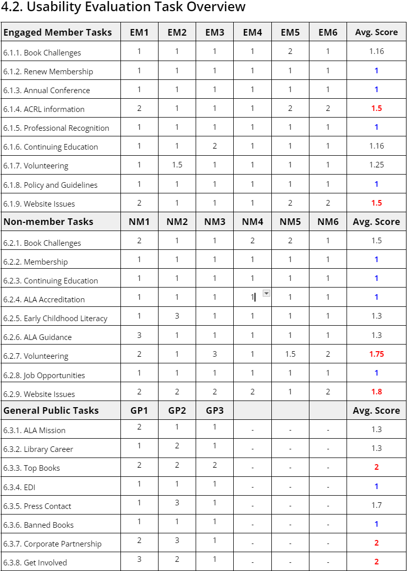
To test what we learned from the Discovery & Strategy phase, the team embarked on a series of usability evaluations with 15 participants (6 engaged members, 6 disengaged members, and 3 members of the general public). Using Zoom and the wireframes from the User Experience & Design phase, we conducted remote usability evaluations, testing how well each group of participants could perform 10 common tasks, such as how to renew membership, learn more about the annual conference, and find professional development opportunities.
Based on the usability evaluations the team identified 11 opportunities to refine the information architecture and wireframes and six significant content enhancements. For example, we learned that some users less familiar with ALA could quickly become frustrated with inconsistent navigation menus in the ALA's 30+ interest groups. This discovery led us to recommend a consistent microsite navigation approach while also allowing some flexibility for each group.
Technical Specification
Working with ALA's technical team, we developed the Technical Specification for the new website. Our Technical Specification is a detailed recipe for the site's construction and ongoing development. By clearly defining the technical standards, hosting configurations, and specific Drupal implementations, this document lays the foundation for a robust, scalable web presence that significantly advances the ALA's mission and service capabilities.
The project introduced a number of interesting challenges, such as developing a new and modern microsite architecture that was flexible enough to accommodate customization by the ALA's special interest groups but consistent enough to solve the user experience challenges of a consistent user experience.
Another challenge was how best to integrate ALA's iMIS membership integration for membership management and Shibboleth Single Sign-On (SSO) for a seamless membership experience.
By switching from on-premise hosting to Pantheon's managed enterprise Drupal hosting, we were able to cut hosting costs by 40%.
Development
The development phase of ALA's website transition to Drupal 9 marked a significant overhaul of its digital presence. Urban Insight's technical team included a Technical Lead, who is a senior Drupal web engineer, two Drupal Engineers, and two senior Front-end developers. This team conducted bi-weekly sprint planning and status meetings.
In developing the ALA website, our team focused not just on technical excellence but on real-world solutions to challenges we encountered along the way. We leveraged our technical skills to address specific issues through custom module development, ensuring that the site was not only functional but also user-friendly and responsive to the ALA community's needs. Here's a look at how we approached problem-solving, with two specific examples that highlight our process.
Integrating the ALA's membership roster into the site posed a unique challenge, particularly in how member information was displayed and managed. We overcame this by developing a method that not only fetches and displays up-to-date roster information in a user-friendly format but also ensures that this data is securely handled and accurately presented. By leveraging a SOAP client and sophisticated caching mechanisms, we made sure that the roster information was always current and accessible, enhancing the functionality of the committee nodes on the website.
The development and implementation phase for the ALA's Drupal 10 website were critical in transforming the association's digital footprint.
Content Migration Strategy
Migrating content for a site of this size and complexity is challenging. Fortunately, we have extensive experience and specialize in complex data migrations. We employed a proven process, which involves meticulously mapping content from the legacy system to the new system and then automating this process. This approach allowed us to perform migrations at multiple points during development, ensuring we had current content while also providing multiple opportunities to identify and correct any issues with content migration.
Part of the content migration process also included optimizing and refining the content. For example, we identified inefficiencies in the legacy site’s method of managing and displaying committee information, which was cumbersome and not user-friendly. We developed a custom solution that uses an API to dynamically display committee information in an easy-to-navigate format. This innovation not only saved time for administrators but also enhanced the user experience for members seeking to find and engage with committee details.
Addressing the complexity of the migration, the team successfully consolidated 40+ separate sites, which were developed on dated technology and programming languages, into one main site with 30 microsites. This required exhaustively mapping every single field, combining and consolidating multiple content types, and merging taxonomy terms. These efforts ensured a seamless integration of diverse content sources into a unified and coherent web presence, significantly improving site manageability and user accessibility.

Testing & Quality Assurance
Testing and Quality Assurance (QA) play a pivotal role in any project, underpinning the success of the final deliverable. Achieving exceptional quality assurance can transform a good project into a great one, instilling confidence in your team and delight in your users.
For ALA, we employed a dual-faceted strategy of both manual and automated testing.
Manual Testing for User-Centric Insights: Our manual testing process involves creating detailed scripts that mirror real-world usage scenarios across various user roles. By engaging our QA team to execute these scripts, we delve deep into the user experience, uncovering any obstacles or glitches that could detract from the smooth operation and intuitive interaction with the website. This hands-on approach is crucial for identifying nuances in user experience and ensuring that the website is not just functional, but also user-friendly and accessible.
Automated Testing for Efficiency and Coverage: Complementing our manual efforts, we used the power of automated testing to broaden our quality assurance scope. In this case, we used Visual Regression Testing, and Cypress, to automate the detection of inconsistencies and errors. This method allows us to cover more ground in less time, identifying potential issues before they affect the end user.
CONCLUSION
We are grateful to have had the chance to continue our long-time collaboration with the American Library Association on this important redesign and upgrade. Embarking on this journey with the American Library Association (ALA) has been a rewarding experience, culminating in a project that transformed their digital presence.
With its intuitive design and enhanced functionality, the revitalized platform mirrors the ALA's commitment to innovation and accessibility while providing a more engaging experience for members and non-members alike. This project marks the beginning of a promising new chapter for the ALA, one where their digital strides continue to empower, educate, and connect.
